Institutional Data Art
Four Portraits of American Life
A series of four data artworks developed with NORC from research on care, health, and society.
01 / 04
National Survey of Early Care and Education
Orbits of Care
This artwork shows how American families combine different kinds of care for young children. The organised centre represents structured, licensed care. The looser outer orbit represents care shared with grandparents, neighbours, family friends, and other informal networks.
The image is built from the National Survey of Early Care and Education. Every child in the sample is a node, connected to children with similar weekly care arrangements. A larger node means that a child moves through more care settings. Colour shifts from pale white to gold as income rises.
The image makes two systems visible at once: formal care services and the personal relationships that support everyday family life.
02 / 04
Healthcare Cost and Utilization Project
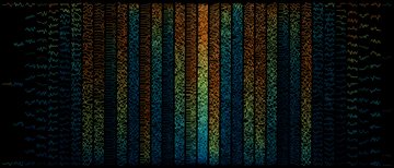
Where Health Holds
This artwork shows how the burden of potentially preventable hospitalizations varies from county to county. Even within the same state, neighbouring counties can have very different histories.
The image is built from thirteen years of records in the Healthcare Cost and Utilization Project. Each thin line represents one county from 2011 to 2023, with counties grouped into columns by state. Dark blue marks a lower average burden; copper and amber mark a higher one.
The work is not a ranking of counties or a diagnosis of failure. It makes a local and uneven health pattern visible at a national scale.
03 / 04
General Social Survey
The Social Chorus
This artwork is a map of what the General Social Survey has asked Americans about since 1972. Major subjects such as politics, religion, race, health, work, and culture form the large folds. Questions that return across many surveys create stronger and more continuous paths.
The image is built from the survey's subject hierarchy and the years in which each question appeared. The bright centre represents the survey as a whole. The large folds divide into subtopics and individual questions, while the outer halo records their activity from 1972 to 2024.
The work shows which questions exist and how often subjects return. It does not show what people answered or whether public opinion moved in a particular direction.
04 / 04
National Longitudinal Survey of Youth
The Long Becoming
This artwork compares two generations followed by the National Longitudinal Survey of Youth: NLSY79 and NLSY97. It shows how patterns in education, work, income, poverty, and marriage differ across the two cohorts and across income groups.
The image has two mirrored halves. Warm orange and gold represent the older NLSY79 cohort; cool blue and cyan represent the younger NLSY97 cohort. Each horizontal row is one measure, and the marks within it are grouped by income tier. Darker colours indicate lower-income groups and brighter colours indicate higher-income groups.
The marks summarize groups rather than depicting people one for one. Longer bars toward the centre indicate a higher typical value; thicker and denser fields show how respondents are distributed. The image is a comparison, not a literal timeline or a claim that income caused the other patterns.
In print