This article was originally published on ArtsCabinet.
So, What Makes Art Art?
A timeless question has animated arguments for tens of thousands of years, as humans have found countless ways to express ideas and explore the human condition.
Given the complexity of the question, I choose to answer from the perspective of the growing artistic movement I belong to: Data Art.
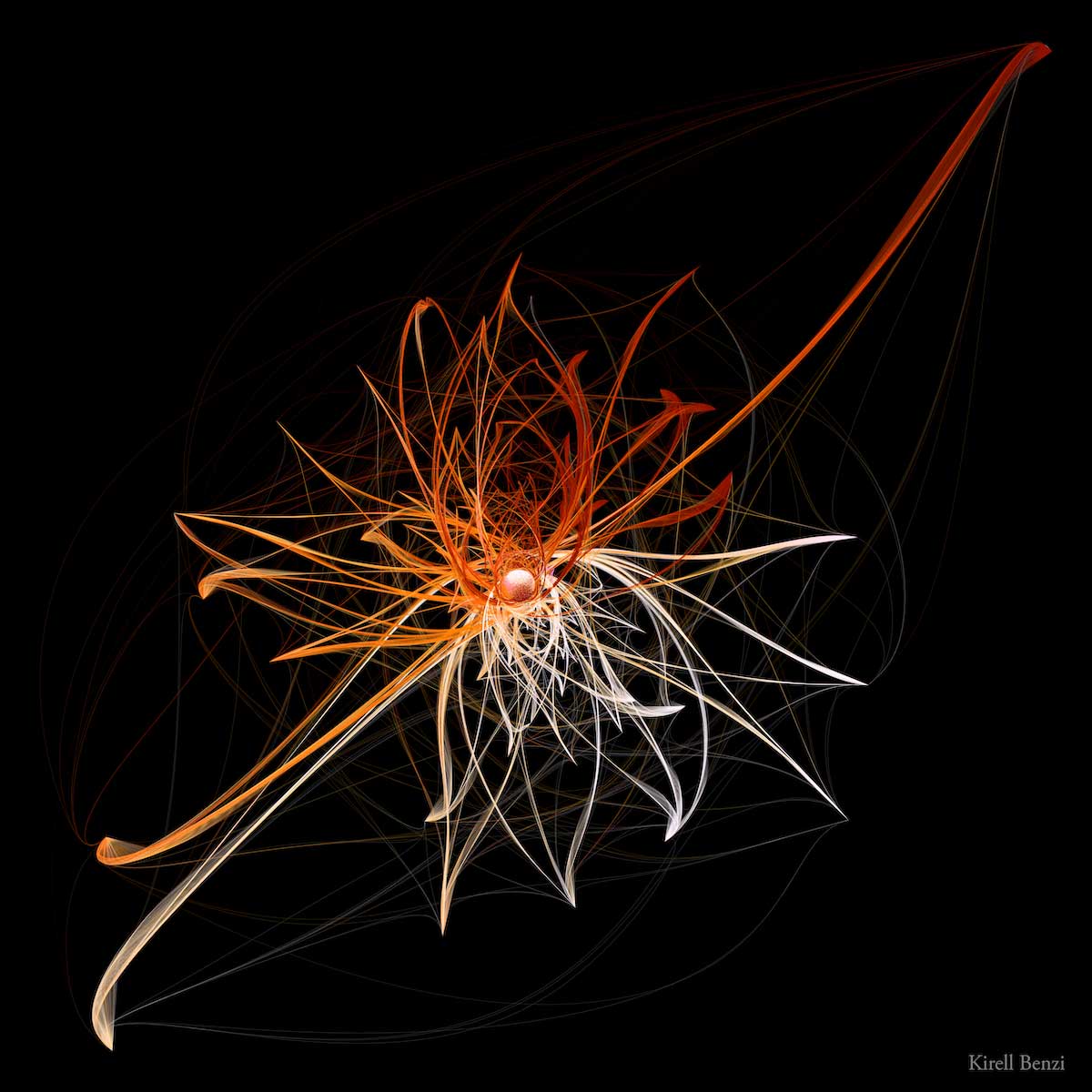
In one sentence, Data Art uses facts, information, or statistics about a phenomenon to drive the artistic representation. It stems from generative art and data visualization, and belongs broadly to new media art.
In simpler words, data art translates rows and columns, measurements, observations, or relationships into a visual representation that is hopefully aesthetically compelling. It has a scientific component wrapped into an artistic representation.
The fact that it is based on real data adds a unique layer of meaning to the piece. For the first time in art history, the fabric of an artwork can be based on genuine facts and an objective measure of something, rather than solely on the artist's subjective view. I put objective in quotation marks because the data we collect is always subject to some form of bias and can never be purely impartial.
Even though a data artwork relies on algorithms, its final representation is not limited to digital imagery. It can also become physical data sculpture, painting, print, music, performance, or movement.
Why Does It Matter?
The intrigued reader might wonder why Data Art has yet to take the art world by storm.
First, the discipline is still young and needs more practitioners to become mainstream. Second, because it is rooted in technology and science, part of its appreciation depends on scientific literacy.
Subjects like big data, artificial intelligence, quantum computing, and blockchain are often over-hyped and rarely discussed with the right level of detail. As a result, technology can feel threatening, especially when public narratives focus mostly on its darker sides.
Data Art can act as a counterweight to those fast-paced narratives. It invites us to look at data from an unexpected angle: emotion. Once that hook is in place, it lets us process the information with our rational side. The principal difficulty for the artist is to find the right balance between science and art.
Measuring the Impact of Data Art
Most artists want to be understood. As a data artist, one of my recurring questions is whether the message behind a piece is clear, and whether the data plays an essential role in helping the audience question itself.
As a scientist, I could not resist looking for ways to test this. The field of aesthetics research studies art appreciation using scientific methods. Some studies suggest that untrained viewers often focus first on subject matter, technique, or color, while art-trained viewers pay more attention to composition and deeper meaning.
It seems that beauty is either in the eye or in the mind of the beholder.
For data art appreciation, much remains to be done. That is exactly what makes the field interesting: it opens space for artistic practice, public interpretation, and research to meet.
I hope this short essay gives a useful entry point into data-driven art. At its best, data art is not a chart made prettier. It is a way to make structure felt.