An earlier version of this essay was published in Nightingale on Medium on September 15, 2020. This edition has been adapted for Kirell Benzi Studio.
Organizational charts are usually seen as administrative documents. They define reporting lines, departments, and managerial responsibility. They help people understand who reports to whom, and they help companies maintain a formal view of their own structure.
But they also contain something more interesting: a network.
Every reporting line is a connection. Every department is a cluster. Every branch of the hierarchy carries information about scale, distribution, density, responsibility, and distance from leadership. If the dataset is handled carefully, the humble org chart can become a way to observe how a company is built, how it has changed, and how it understands itself.
That was the starting point for Together, a network artwork based on the hierarchy of the Havas group.
Getting The Data
The project began while I was working within the Havas group. Havas had recently migrated to Workday, including an internal people and hierarchy system. For a data artist, this was a compelling structure: employees, locations, companies, job titles, and reporting lines could be treated as a graph.
The sensitive part was obvious from the beginning. Organizational data is personal and operational. The work therefore used anonymized, GDPR-compliant information, with no employee names, and with the consent of the HR department. The public artwork and process notes only expose the structural layer, not private details.
Even at that structural level, the data was rich. A direct manager relationship creates a simple tree from leadership to the lowest entry positions. On paper, that sounds straightforward. In practice, a global organization contains branches, sub-branches, mergers, aliases, agencies, legacy structures, and uneven platform migration. The result is not just a chart. It is an organizational landscape.
Seeing The Hierarchy
The first step was conventional data visualization. I started with a radial tree layout, placing the top of the organization at the center and drawing reporting levels outward.
This kind of view is useful because it makes hierarchy legible. You can count levels. You can see branches. You can understand how the organization expands from a central node into different groups and agencies.
But as the network grows, the limits appear quickly.
Many nodes occupy almost the same visual space. Density becomes hard to judge. Proximity in the image does not always mean proximity in the organization. Angular layouts can make it difficult to compare volume precisely. The visualization explains the hierarchy, but it does not fully communicate the weight, complexity, or feeling of the system.
This is often the threshold where data visualization and data art begin to diverge.
When Accuracy Is Not Enough
A visualization can be correct and still fail to carry the experience of the data.
For an internal analysis tool, the priority might be comparison, filtering, and measurement. In that context, a companion chart, table, or dashboard would be the right answer. A bar chart could show employee volume per branch. A filter could isolate agencies. A table could expose managerial depth or job-title distribution.
For an artwork, the question changes.
The piece still needs to respect the data. The structure cannot be arbitrary. But the final image also has to carry emotion, rhythm, and identity. It has to stand on its own visually while remaining grounded in the underlying system.
That shift introduces another set of questions:
- What does the organization feel like as a form?
- Which visual compromises are acceptable?
- Should hierarchy be immediately readable, or quietly embedded?
- Can density, complexity, and belonging be felt before they are decoded?
- Does the image still belong to the series of data artworks I am building?
These are not decorative questions. They are part of the translation from data to art.
Iterating Toward An Artwork
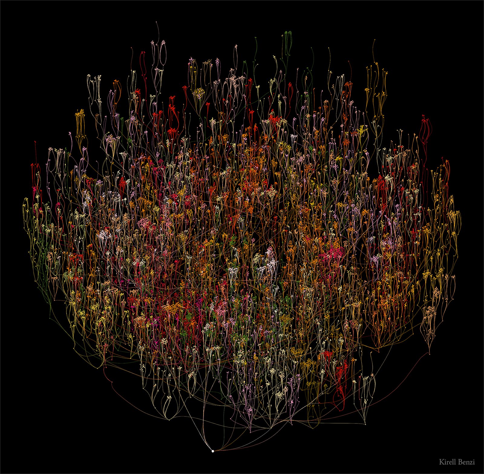
One intermediate version became a fuzzy radial tree. It kept the general logic of the hierarchy but introduced force-directed movement, giving the network a denser and more organic form. The exact levels became harder to read, but the overall mass and distribution of the organization became more apparent.
That version was already more visually alive. It suggested an iris, a living cell, or a collective organism. It was less efficient as a strict hierarchy diagram, but more effective as an image.
Still, it was not finished.
Network layouts often drift toward circles because many algorithms are designed to minimize distance and balance forces around a center of mass. I have used circular forms often in my own work, but for this piece I wanted to break that habit. The artwork needed to move beyond the expected network aesthetic.
I tested more angular and triangular compositions. Some were promising as images, but they erased too much of the hierarchical character of the data. The structure was becoming beautiful at the expense of the concept.
The final direction had to keep the links visible while avoiding the stiffness of a traditional org chart.
Together
Together is the result of those iterations.
The artwork visualizes the hierarchical positions of employees across the Havas group. The CEO connects to executive leadership, those leaders connect to their branches, and the structure continues outward through the organization. Each node remains part of a real reporting system, but the final image is not presented as a management diagram. It is a portrait of a collective structure.
The title matters. An org chart can imply control, distance, and hierarchy. The artwork is interested in something adjacent but different: the way many individual positions form one organization. The data is managerial in origin, but the image points toward interdependence.
That is the value of data art in this context. It does not replace analytical tools, dashboards, or HR systems. It gives the organization another way to see itself. It can reveal structure, but it can also create a shared image around that structure.
Why It Matters
Organizational data can support real decisions. It can help leadership understand reporting depth, distribution of teams, missing capabilities, managerial load, and the effects of mergers or restructuring. Used responsibly, this kind of analysis can be valuable for management, HR, and strategy.
But the same data can also say something about identity.
A company is not only a brand statement, a logo, or a campaign. It is also a network of people, responsibilities, locations, and relationships. Turning that network into an artwork creates a different kind of representation: one grounded in facts, but designed to be seen, felt, and remembered.
That is where data visualization and art collide. The data gives the work its structure. The artistic process gives it presence.